Case study · Product Design
Film Preview Experience for BGR Cinema
A film preview website for BGR Cinema, a fictional independent cinema in Bogor, West Java, that shows Indonesian and foreign films.
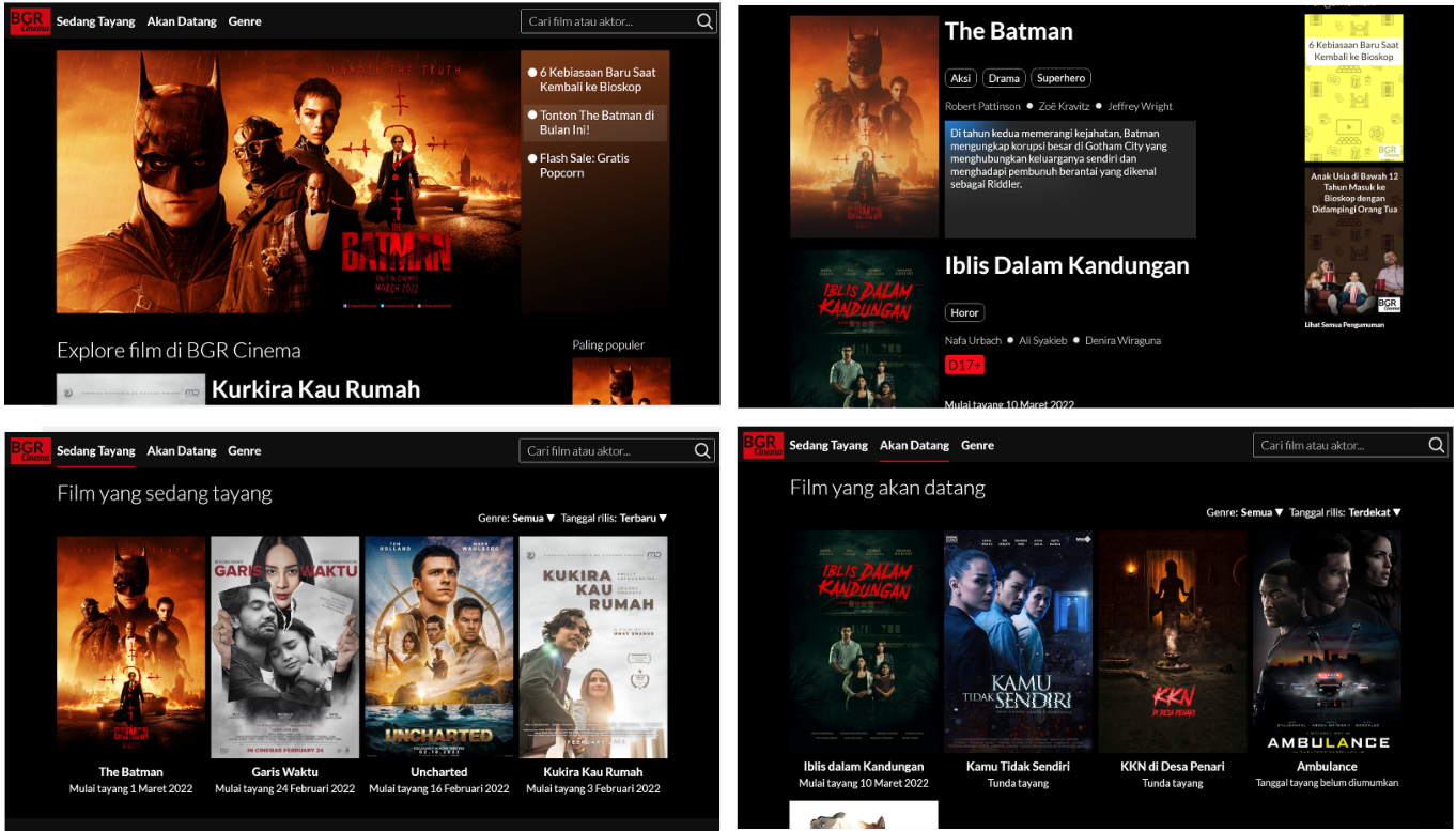
- Role
- Solo UX designer, concept to delivery
- Timeline
- February – March 2022
- Users
- Gen Z and millennial working professionals checking what's showing
- Methods
- Interviews, empathy maps, journey map, wireframes, lo- and hi-fi prototypes, usability study, responsive design
- Outcome
- Participants found the site clear to use; the main menu was the easiest part to reach.
Problem
The cinema's website has no film details such as genre, cast and story, so previewing a film is hard.
Goal
An informative film preview website for a cinema.
01
Understanding the user
Interviews and empathy maps showed people like watching in a cinema for the sound and the screen size, but cinema chains rarely give detailed information about their films.
- BrowsingFinding the right film to watch.
- ExperienceWatching an interesting film with the best sound and screen quality.
- Detailed informationReviews don’t say anything useful about genre, cast or synopsis.
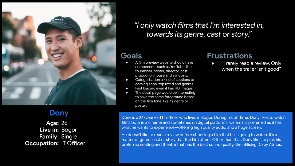
Persona · Dony
A busy employee who unwinds at the cinema. He needs genre, cast and synopsis in one place so he can pick a film quickly in his limited free time.
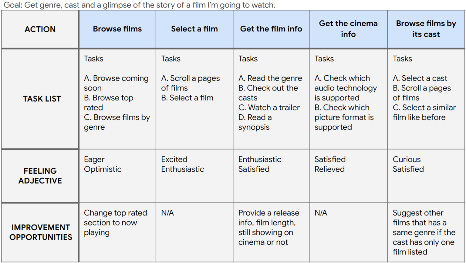
User journey
Mapping Dony’s journey showed how useful a film preview website would be.
02
Starting the design
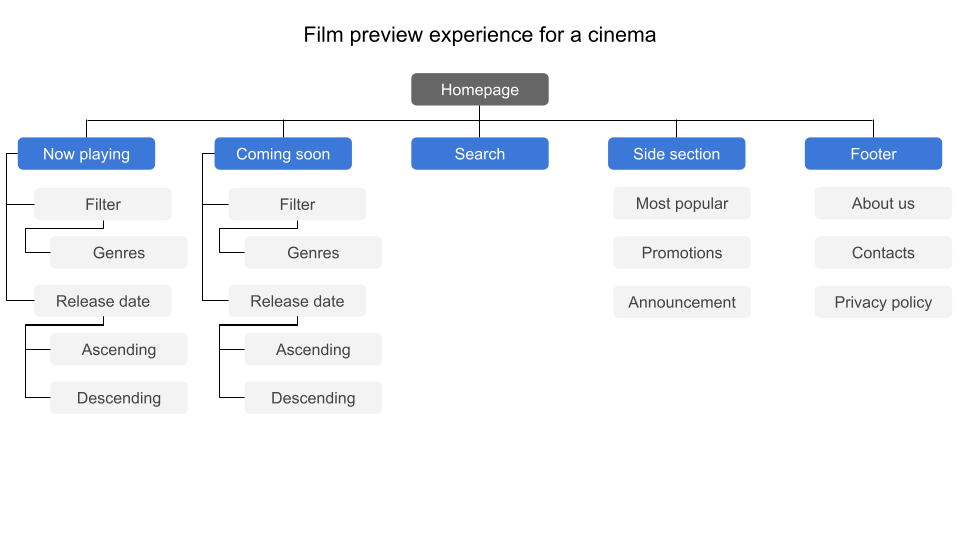
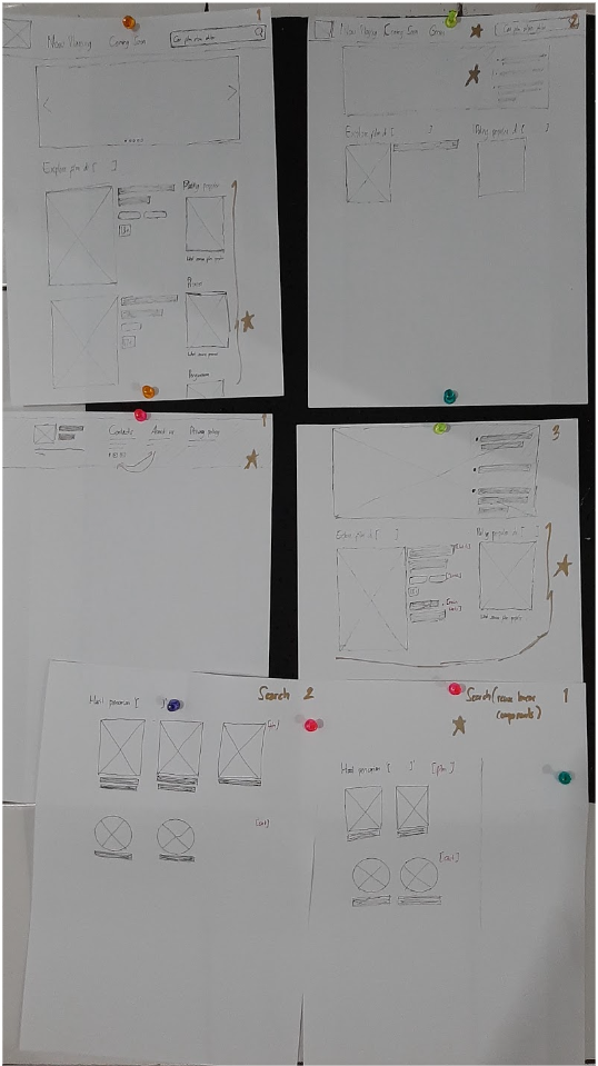
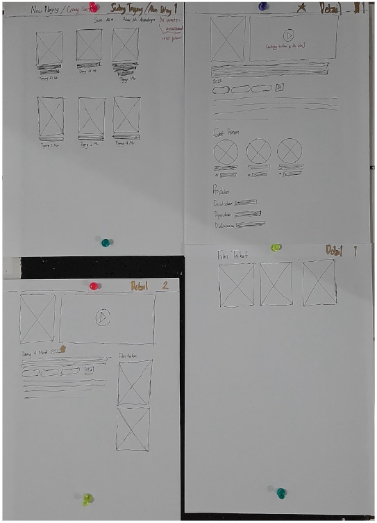
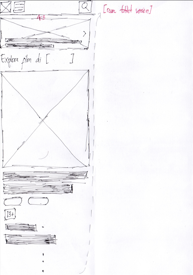
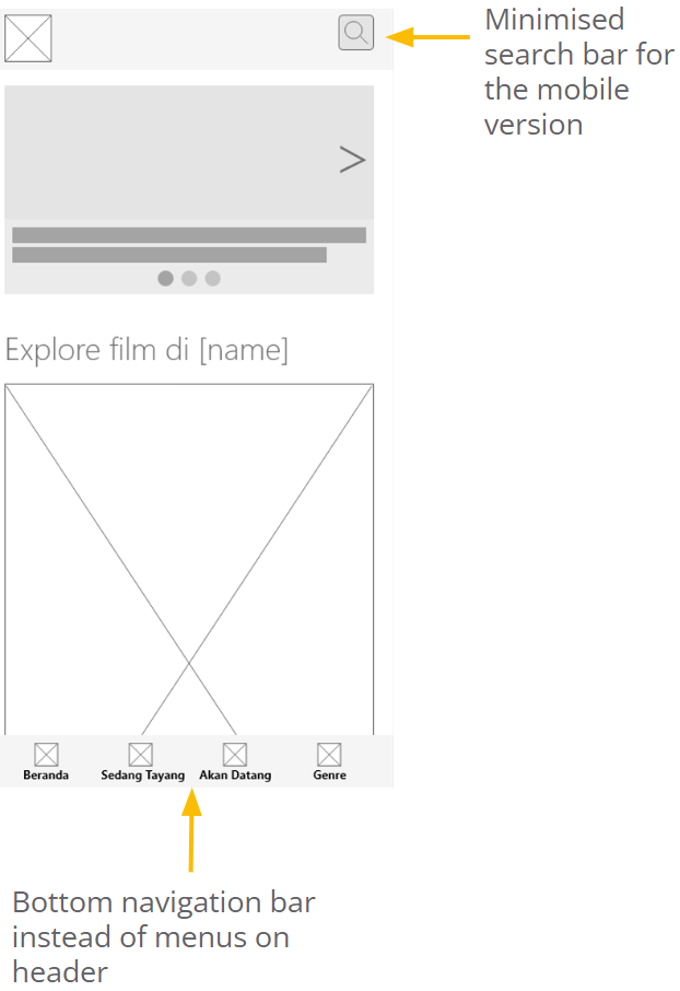
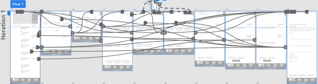
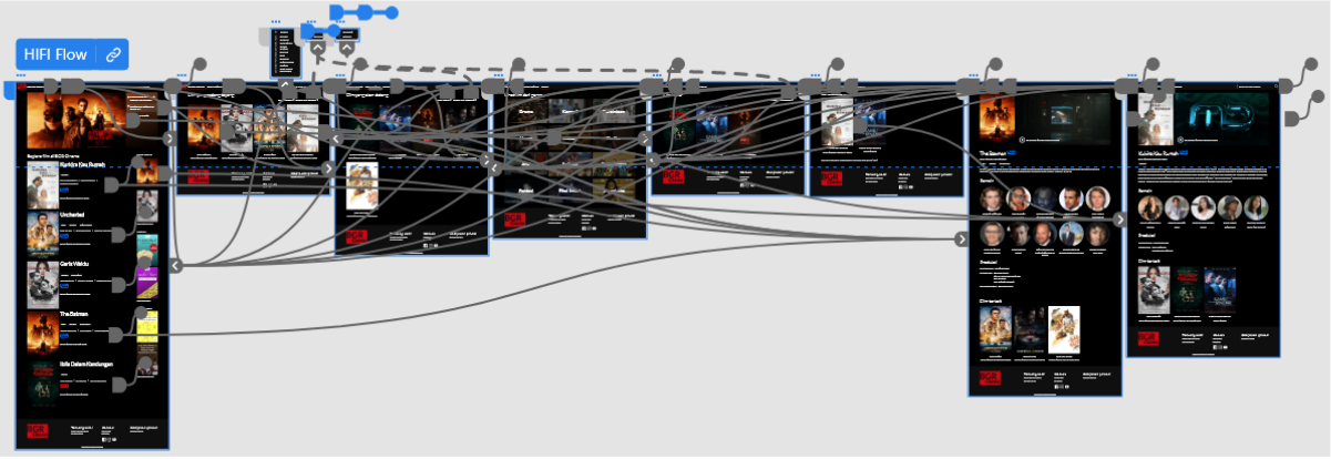
The sitemap came out of the frustration of finding “just the right one”. The structure keeps navigation simple.
03
Usability study
- Type
- Moderated, remote
- Location
- Indonesia
- Participants
- 4
- Length
- 20–30 minutes
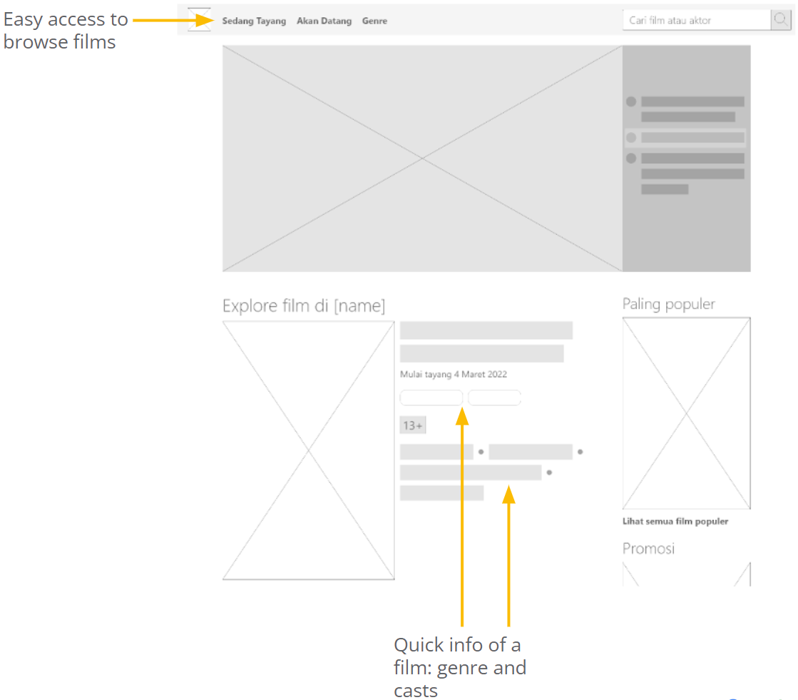
- NavigationThe main menu, Sedang Tayang (Now Showing), was easy to reach.
- LanguageInconsistent language confused participants.
- SearchParticipants suggested changes to the search results page.
04
Refining the design
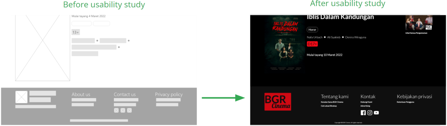
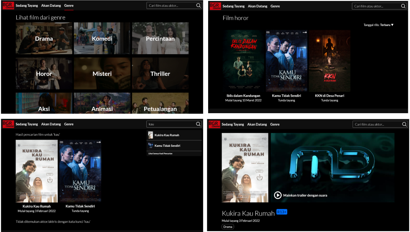
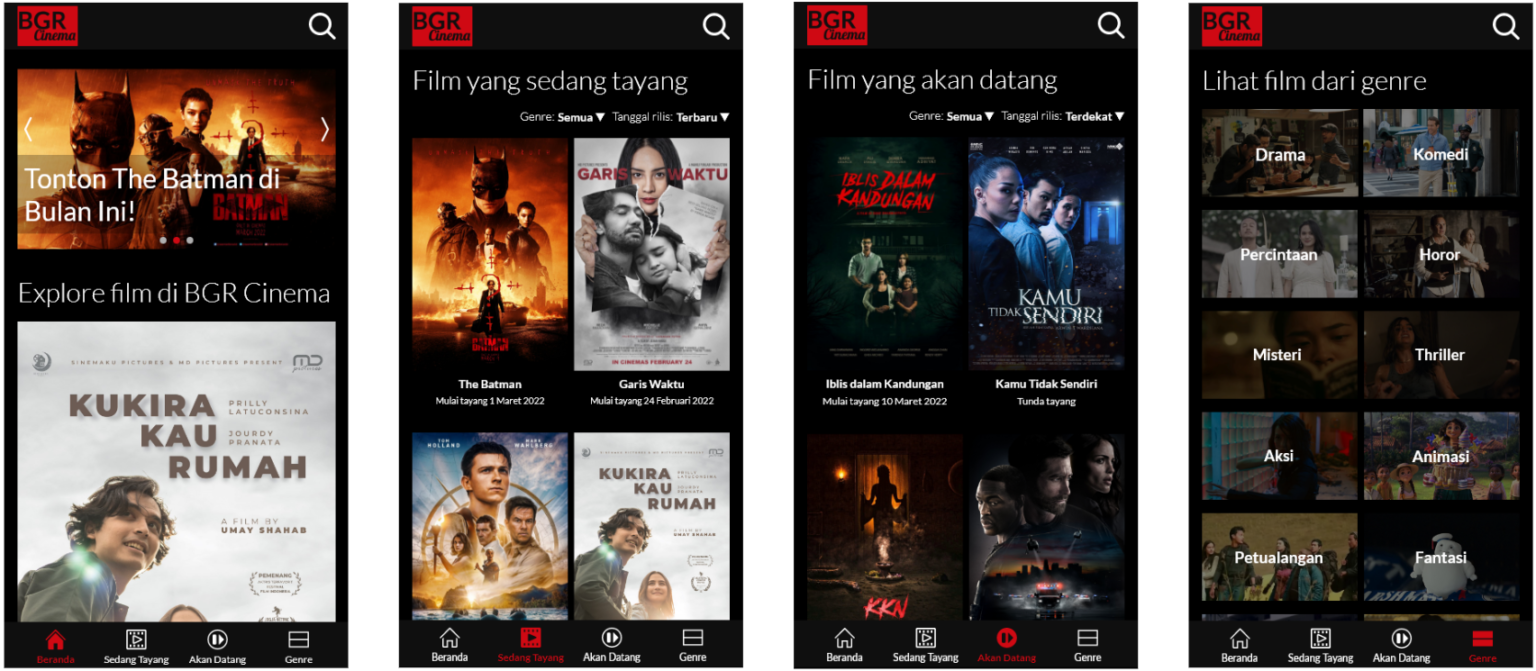
One language throughout
Made the wording consistent across the site to clear up the confusion.
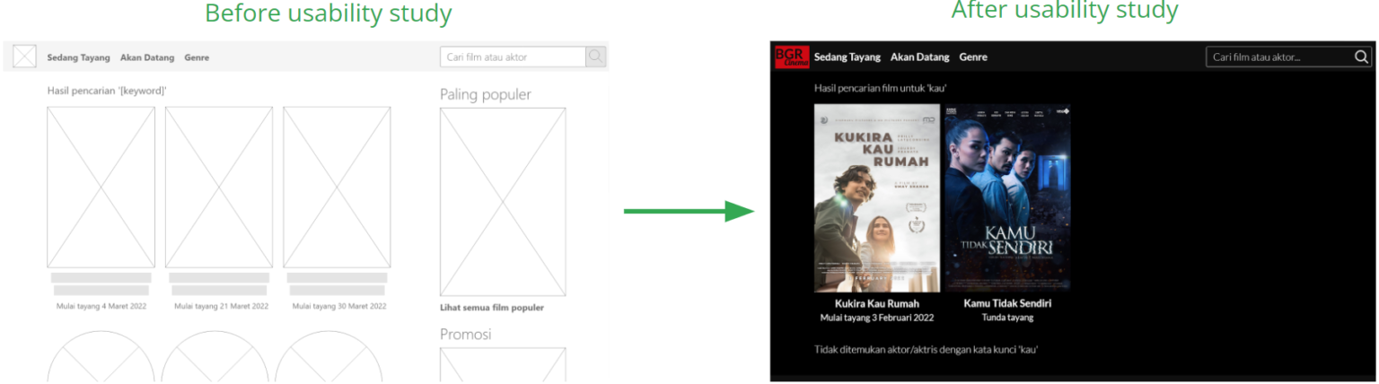
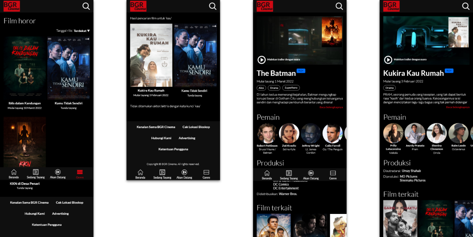
Focused search results
Removed the right-hand panel on the search results page so people can concentrate on the results.
05
Accessibility
A clear visual hierarchy, with headings at distinct sizes.
Bright text, links and buttons on dark backgrounds.
Title, genre, cast and synopsis each presented distinctly.
06
Takeaways
Participants said the site was clear to use, and found the main menu especially easy to reach.
What I learned
Small design changes can make a big difference to the experience, but not every suggestion can be adopted, because people’s opinions differ.
Next steps
- Usability-test the high-fidelity prototype.
- Secondary research on the picture and sound quality of the films the cinema shows.